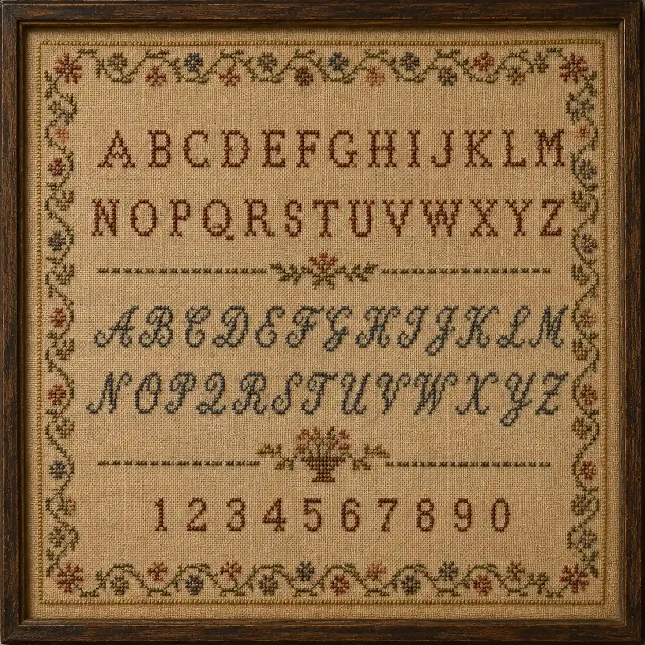
If one single sampler style deserves the title "the classic," it's this one. An alphabet sampler puts a full set of letters - often in more than one size or typeface, sometimes uppercase and lowercase both - at the center of the composition, usually with numerals, a border, and the maker's name and date arranged around it. It's the format most beginners stitch first today, and for good reason: it's genuinely close to what a first-time sampler maker would have stitched two hundred years ago too.
Why the alphabet became the centerpiece
Early band samplers treated the alphabet as one reference row among many. As the sampler format matured through the 17th and 18th centuries, the alphabet increasingly became the whole point of the piece rather than one entry in a working notebook. That shift makes sense given what alphabets were actually for: practicing letterforms a girl would go on to use for marking household linen with initials, monograms, or names - genuinely useful, practiced skill, not decoration for its own sake.
Stitching a full 26-letter alphabet, cleanly and consistently, at a small scale, is also a real technical test - it demands even tension, consistent stitch direction (see stitching direction and consistency), and careful counting across a long, repetitive stretch of fabric. It's not a coincidence that the alphabet became the format's benchmark of skill.
Common layouts
Most alphabet samplers follow a fairly recognizable structure: one or two full alphabet rows near the top, often followed by numerals, then a band of small motifs, and the maker's name, age, and the date near the bottom, the whole thing framed by a border. Some historical examples pair a plain, blocky alphabet with a more ornate, serif-style one on the same piece - practically, a reference for both a quick, sturdy marking font and a more decorative one for special pieces.
Why it's still the best starting project
If you're picking your first sampler-style project, the alphabet sampler is the one I'd recommend without hesitation. It's forgiving to plan (a grid of letters is easier to lay out than a pictorial scene), it teaches consistency and counting fast, and it produces something genuinely personal - your own initials, name, or a message, worked in a format with three or four centuries of precedent behind it. If you want to move beyond a standard layout, how to design your own traditional-style sampler walks through adapting the format to something more your own.
Try it: a project idea
Stitch your own initials or full name in two different alphabet styles on the same piece - a serif set and a simpler block set - the way many historical alphabet samplers paired more than one typeface.